

[02] Dot ID
Dot ID is an industrial design consultancy specialising in creating products that connect people through innovative ideas. I was commissioned to design and develop a complete rebrand and website that reflected their personality while also positioning the business with a contemporary, confident identity.
Inspired by the idea of connecting the dots, the identity combines bold typography, a restrained colour palette and distinctive graphic language,
yet still holds the modesty and approachability of their studio culture.
The website showcases this identity through a clean user-experience that showcases their expertise and communicates their values.
[Brand Identity, Web Design, Art Direction]
The project began with research into the industrial design sector, analysing competitor identities and identifying opportunities to create a brand that felt approachable without compromising confidence. Visual explorations informed the creation of a clean, yet distinctive identity centred around people, creativity and innovation.
The concept of 'connecting the dots' became the core foundation of the
visual language, inspiring an updated supporting graphic system and digital experience. Typography was chosen for its simple yet bold form, while a restrained neutral palette, complemented by a primary accent colour, creates contrast and draws attention to key messaging.
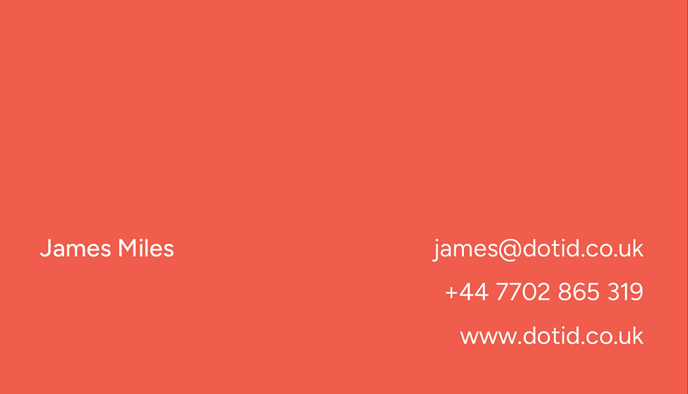
Once the identity system was established, it was applied across many varied touchpoints; a responsive website, presentations, outreach assets, socials, and brand guidelines. Every element, including spacing and sizing, was considered to create a cohesive experience that reflects Dot ID's values
and expertise.


Contact
[02] Dot ID
[Brand Identity, Web Design,
Art Direction]
Dot ID is an industrial design consultancy specialising in creating products that connect people through innovative ideas. I was commissioned to design and develop a complete rebrand and website that reflected their personality while also positioning the business with a contemporary, confident identity.
Inspired by the idea of connecting the dots, the identity combines bold typography, a restrained colour palette and distinctive graphic language, yet still holds the modesty and approachability of their studio culture. The website showcases this identity through a clean user-experience that showcases their expertise and communicates their values.


The project began with research into
the industrial design sector, analysing competitor identities and identifying opportunities to create a brand that felt approachable without compromising confidence. Visual explorations informed the creation of a clean, yet distinctive identity centred around people, creativity and innovation.
The concept of 'connecting the dots' became the core foundation of the visual language, inspiring an updated supporting graphic system and digital experience. Typography was chosen for its simple yet bold form, while a restrained neutral palette, complemented by a primary accent colour, creates contrast and draws attention to key messaging.
Once the identity system was established, it was applied across many varied touchpoints; a responsive website, presentations, outreach assets, socials, and brand guidelines. Every element, including spacing and sizing, was considered to create a cohesive experience that reflects Dot ID's values
and expertise.
Contact
[02] Dot ID
[Brand Identity, Web Design, Art Direction]
Dot ID is an industrial design consultancy specialising in creating products that connect people through innovative ideas. I was commissioned to design and develop a complete rebrand and website that reflected their personality while also positioning the business with a contemporary, confident identity.
Inspired by the idea of connecting the dots, the identity combines bold typography, a restrained colour palette and distinctive graphic language,
yet still holds the modesty and approachability of their studio culture.
The website showcases this identity through a clean user-experience that showcases their expertise and communicates their values.
The project began with research into the industrial design sector, analysing competitor identities and identifying opportunities to create a brand that felt approachable without compromising confidence. Visual explorations informed the creation of a clean, yet distinctive identity centred around people, creativity and innovation.
The concept of 'connecting the dots' became the core foundation of the
visual language, inspiring an updated supporting graphic system and digital experience. Typography was chosen for its simple yet bold form, while a restrained neutral palette, complemented by a primary accent colour, creates contrast and draws attention to key messaging.
Once the identity system was established, it was applied across many varied touchpoints; a responsive website, presentations, outreach assets, socials, and brand guidelines. Every element, including spacing and sizing, was considered to create a cohesive experience that reflects Dot ID's values and expertise.